In the modern enterprise, the problem isn’t a lack of information; it’s the “dashboard fatigue” that comes from having too much of it. Most managers spend their mornings toggling between Google Sheets, CRM exports, and static visual reporting tools, trying to piece together a coherent story.
Effectively learning how to visualize complex business data is no longer a niche skill for a data science department; it is a fundamental requirement for business intelligence and sustainable growth. But as the volume of information explodes, traditional methods are hitting a breaking point. To move from confusion to data-driven decisions, we must understand where traditional visualization fails and how AI-powered insights are redefining the landscape.
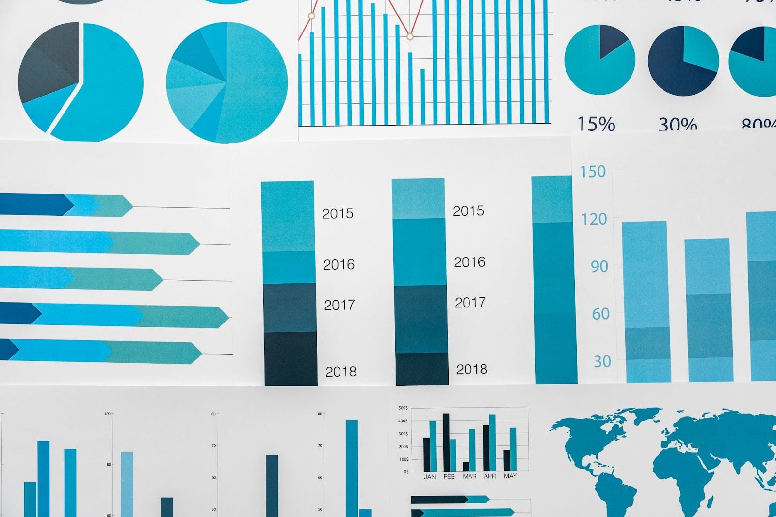
The Traditional Approach: Why Static Dashboards Fail
For decades, companies have relied on manual visual reporting to interpret their growth. By aggregating fragmented data sources into a standard toolkit of chart types, teams create visual representations of performance. However, these static methods often obscure the truth, leaving decision-makers drowning in numbers without clear direction.
The Standard Reporting Toolkit
Most teams are familiar with these foundational visualization techniques:
- Bar Charts: Ideal for comparing quantities across different categories, such as sales trends by region.
- Line Graphs: The go-to for time series analysis, helping teams track a key performance indicator (KPI) over months or years.
- Pie Charts: Often used to show proportions, though they frequently contribute to visual clutter when too many variables are involved.
- Geographic Visualizations: Essential for logistics performance and mapping geographic data to understand market penetration.
The “Dashboard Death” Cycle
While these data visualization tools were revolutionary twenty years ago, they often fail in a high-velocity environment. Traditional interactive dashboards frequently become “graveyards of data” where insights go to die. The failure of traditional business analytics usually stems from three issues:
Stale Data
Manual exports and spreadsheet formatting create a massive lag between reality and reporting. By the time a sales report is finally polished and presented, the market has already shifted, making your data-driven decisions reactive rather than proactive and strategic.
Lack of Context
A bar chart might show a dip in customer engagement, but it lacks the “why.” Without connecting social media analytics or external trends, these visual elements remain isolated, failing to explain how different business functions impact your bottom line.
The Complexity Barrier
Implementing advanced data visualization techniques typically requires a data science degree or specialized domain knowledge. This creates a bottleneck where stakeholders must wait for analysts to interpret visual reporting, slowing down the entire business intelligence process and delaying action.
Stop drowning in data and start driving results with Mack’s intelligent insights
Explore how to transform your data reporting
The Future of Data Visualization: The AI Approach
The leap from off-the-shelf solutions to custom AI development has changed the “how” of visualization. We are moving away from clicking filters and toward natural language generation and generative AI.
Natural Language: The Ultimate “Interface”
The most complex data is best visualized when you can simply ask for it. Instead of building a complex Geo BI map manually, you can ask platforms like Mackdata: “What was my top-performing zip code last quarter?” The AI performs the data science processes in the background, querying the business data models, applying time series analysis, and filtering geographic data, to give you a clear, visual answer in seconds.
Human-in-the-Loop AI
While AI algorithms handle the heavy lifting of data analytics, the most effective systems utilize human-in-the-loop AI. This ensures that the AI-powered insights align with actual business functions and operational realities. It combines machine speed with the strategic oversight of your domain knowledge.
The future isn’t a dashboard; it’s a conversation with your data!
The MACK Framework: A New Standard for AI Marketing Intelligence
To overcome the limitations of static imagery, businesses are turning to platforms like Mackdata. Mack (the “intelliphant”) replaces the frustration of “confusing dashboards” with a foundation of Measurable, Actionable, Centralized Knowledge (MACK).
1. Measurable: Beyond Impressions
Traditional visual data representations often focus on “vanity metrics” like clicks. True business data models must link every marketing dollar to actual revenue. This requires closed-loop attribution, connecting campaign performance directly to the final sale—from the first click to the final POS ring.
2. Actionable: Recommendations Over Reports
A chart is just a picture; an insight is a roadmap. Instead of just viewing a line graph of declining leads, an AI-powered platform provides automated insights. It doesn’t just show you what happened, it utilizes AI algorithms to suggest what to do next based on real-time performance and seasonal patterns.
3. Centralized: One Source of Truth
One of the biggest hurdles in data modelling tools is fragmented data. When customer activity is in a CRM, transactions are in a POS, and audience analysis is in a third-party tool, the “big picture” is impossible to see. Mackdata consolidates your CRM, POS, call tracking, and customer insights into one unified view.
4. Knowledge: Predictive Wisdom
Using historical patterns, AI moves beyond reporting on the past to providing predictive insights. This allows for accurate forecasting of lead volume and revenue trends, transforming raw numbers into high-level wisdom so you can plan with confidence.
Build your business on a foundation of measurable, actionable, and centralized knowledge
Learn more about our AI marketing intelligence platform
Closing the Loop: How Different Sectors Visualize Success
Generic charts fail because they ignore the unique nuances of your field. Effective visual reporting must align with your specific business process modeling to be useful. By tailoring visualization techniques to industry-specific outcomes, companies can transform raw customer activity into a strategic roadmap that drives measurable revenue and growth.
Industry Specific Applications
Home Services
These businesses rely on Zip 2 Zone analysis. Visualizing revenue by zip code allows owners to see exactly where their ad spend is converting into booked jobs, moving beyond simple “lead counts.”
Real Estate
Investors use audience analysis and life-event signals to visualize their pipeline. Seeing a visual representation of a deal moving from “first contact” to “closed contract” is vital for business analytics.
Retail
Physical retailers benefit from Geo BI that tracks “parking-lot pings to POS rings.” Visualizing customer engagement across both e-commerce and brick-and-mortar stores provides a true omnichannel view.
Get the industry-specific intelligence your business deserves with our tailored AI models
Why Choose Mackdata as Your Business Data Visualization Tool?
At Mackdata, we believe your intelligence should work for you, not the other way around. We’ve moved beyond static imagery to provide a foundation of Measurable, Actionable, Centralized Knowledge. Our platform doesn’t just show you what happened; it empowers you to dictate what happens next with absolute confidence.
- Conversational AI Interface: Stop digging through complex interactive dashboards. With Mack, you simply ask questions in natural language. Whether querying sales trends or campaign performance, you get instant, visual answers without needing a data science degree.
- Closed-Loop Revenue Attribution: We connect every marketing dollar to actual revenue. By integrating your CRM and POS, we track the journey from the first click to the final sale, providing visual representations of true ROI.
- Predictive Actionable Insights: Mack uses AI algorithms to transform historical patterns into future wins. Our automated insights don’t just identify a key performance indicator dip; they provide specific recommendations to optimize your business functions today.